How To Plan And Coordinate Colours For A Home Renovation
Embarking on a home renovation journey is an exciting endeavor, and one of the most impactful aspects is the choice of colours.
The colours you select can transform a space, influencing the mood and atmosphere of each room.
In this guide, we’ll explore the art and science of coordinating colours for a home renovation, from understanding colour theory to practical tips on implementation.
Understanding Colour Theory And The Colour Wheel
Before diving into colour choices, it’s crucial to grasp the basics of colour theory and the colour wheel.
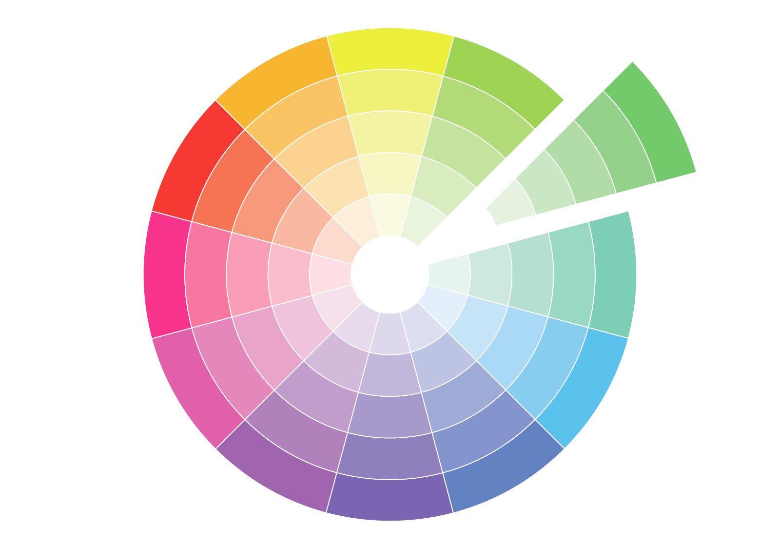
Simply put, the colour wheel is a circular diagram of colours arranged by their chromatic relationship.
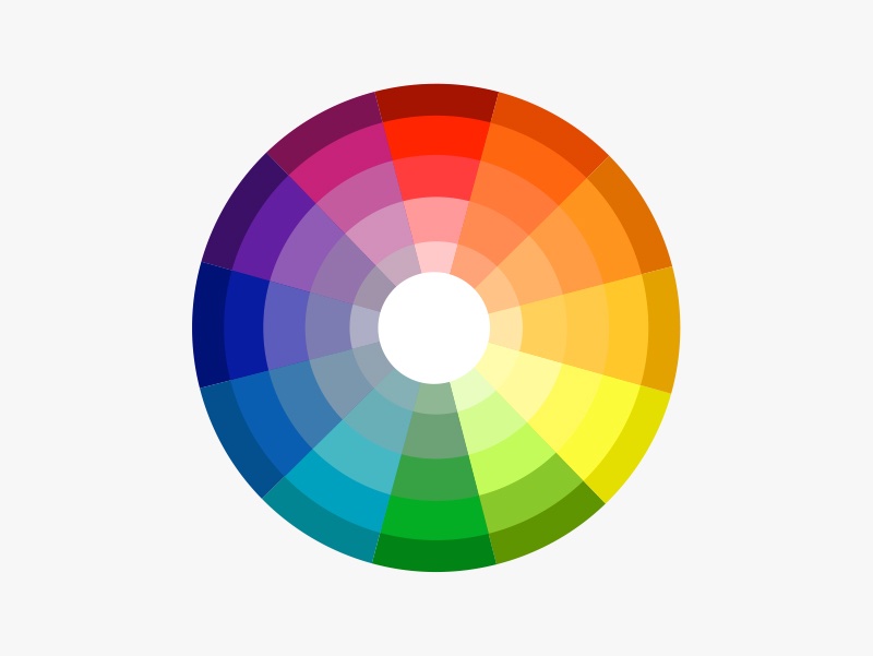
It’s a visual representation that helps us understand the organization of colours and how they relate to one another. The primary colours—red, blue, and yellow—are positioned equidistant from each other on the wheel, forming the basis for all other colours.
When you combine equal parts of two primary colours, you get secondary colours, which are green, orange, and purple.
That aside, there are also tertiary colours, which are created by mixing a primary colour with a neighboring secondary colour. This results in a more nuanced and complex range of colours, allowing for greater variety in your colour palette.
Tertiary colours include blue-green colours, such as cyan, turquoise, teal and aqua, red-orange colours such as tangerine, rust, sandstone, and yellow-green colours such as chartreuse and lime green.
Complementary vs Analogous vs Monochromatic Colour Schemes
When choosing and coordinating colours, there are three fundamental approaches that you can use: complementary, analogous, and monochromatic.
In this section, we’ll explain each of these schemes, and tell you all you need to know about them.
Complementary colour schemes
In the realm of colour theory, the complementary colour scheme is a dynamic interplay of opposites.
Picture the colour wheel, where colours positioned directly across from each other form complementary pairs. This scheme thrives on contrast, creating visually striking combinations that captivate the eye.
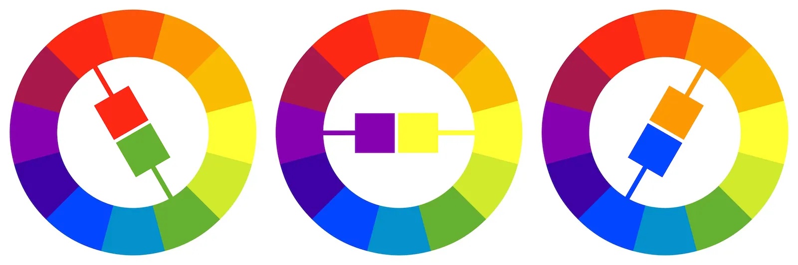
Complementary colours draw attention and add excitement to a space. They can be particularly effective in areas where you want to create a focal point or make a bold statement.
While the contrast is strong, careful use of complementary colours can achieve a balanced and visually appealing result.
Examples of complementary colours include:
- Red and Green: This classic complementary pair creates a vivid and energetic contrast.
- Blue and Orange: The strong contrast between blue and orange adds vibrancy to a colour palette.
- Yellow and Purple: Combining yellow and purple results in a visually striking and balanced composition.
Complementary colour schemes work well in spaces where you want to create drama or highlight specific elements. Consider using this scheme in accent walls, furniture, or accessories for a bold and captivating look.
Analogous colour schemes
On the flip side, analogous colour schemes embrace a more harmonious approach.
In this scheme, colours positioned adjacent to each other on the colour wheel come together to create a seamless and balanced palette.
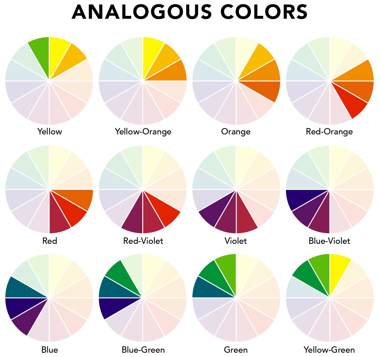
Unlike the bold contrasts of complementary colours, analogous colours share similar undertones, offering a sense of unity and subtlety.
While not as high-contrast as complementary colours, analogous schemes provide a more subtle and calming visual experience.
Analogous colour schemes are versatile and well-suited for various design styles. They work particularly well in spaces where you want to create a unified and balanced feel.
Examples of analogous colours include:
- Blue, Blue-Green, and Green: This analogous scheme in cool tones creates a serene and calming atmosphere.
- Red, Red-Orange, and Orange: Warm analogous colours convey energy and a sense of coziness.
- Yellow, Yellow-Green, and Green: An analogous scheme in these hues provides a fresh and natural appearance.
Analogous colour schemes are excellent for creating a cohesive and inviting environment. Use them in rooms where you want a relaxed and balanced feel, such as bedrooms, living rooms, or areas meant for unwinding.
Monochromatic colour schemes
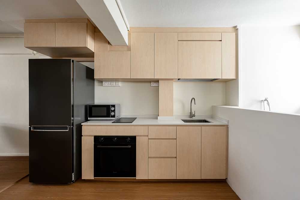
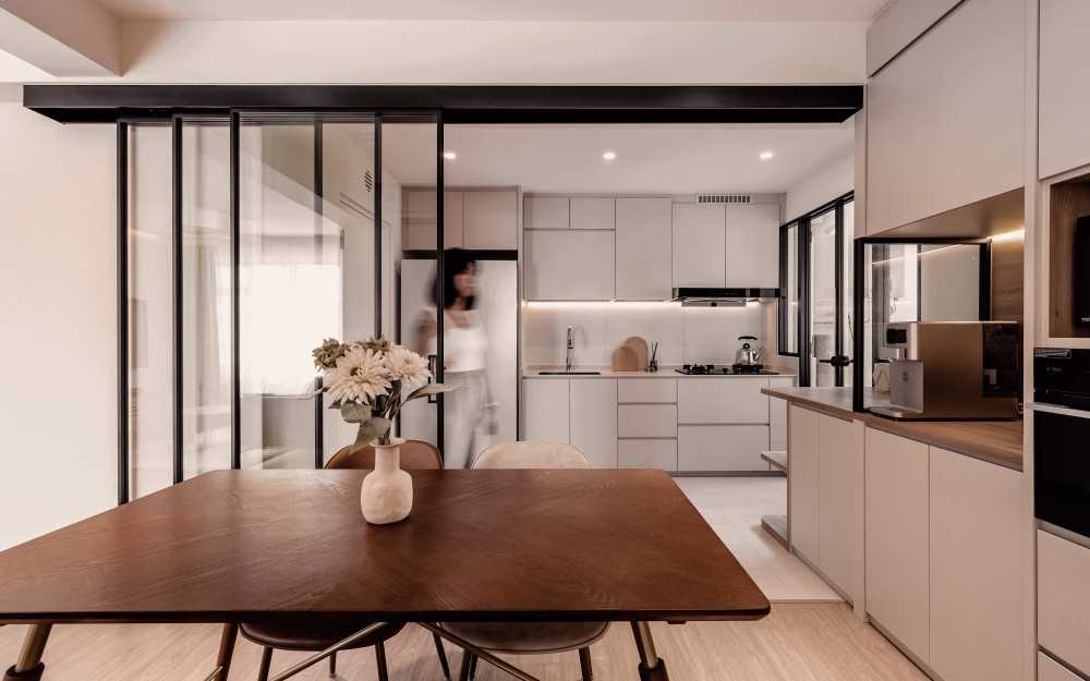
A colour scheme that predominantly features muted and neutral colours, such as beige, white, and other subtle tones, often falls under the category of a monochromatic colour scheme.
Traditionally, a monochromatic colour scheme strictly involves using variations in lightness and saturation of a single colour. This means working with different shades and tints derived from a single base colour.
For example: a traditionally monochromatic room might be entirely blue, using lighter and darker versions of blue for variety.
However, in the modern era of design, especially in contemporary homes where neutral and muted tones are prevalent, the concept of a monochromatic colour scheme has evolved.
In this context, monochromatic designs involve a single colour family rather than a single colour. Istead of just choosing to stick to a single colour, you might work within a broader spectrum of colours that share a common base.
For example: if the chosen colour family is beige, it might include various shades of beige, cream, taupe, and other closely related muted tones.
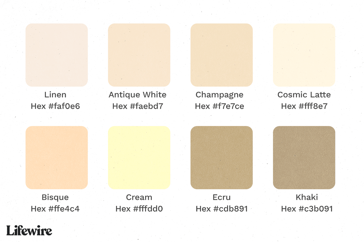
This modern interpretation allows for more flexibility and less strict adherence to a single colour, providing a nuanced and sophisticated look without sacrificing the overall harmony and cohesion associated with a monochromatic palette.
It acknowledges that a contemporary monochromatic room can draw from a range of closely related hues within a family, maintaining a cohesive and elegant aesthetic while allowing for a bit more diversity in the colour palette.
Monochromatic colour schemes provide a versatile backdrop, allowing for the incorporation of various textures, materials, and accent pieces without overwhelming the space.
This colour scheme often aligns with contemporary design principles that emphasize clean lines and simplicity.
Examples of colours used in monochromatic colour schemes:
- Beige and cream: A monochromatic scheme featuring different shades of beige and cream creates an elegant and timeless look.
- White and gray: Using white and various shades of gray produces a modern, minimalist aesthetic.
- Taupe and soft browns: Incorporating taupe and muted brown tones offers warmth and sophistication in a monochromatic palette.
Monochromatic colour schemes are well-suited for spaces where a clean and serene atmosphere is desired.
These schemes work seamlessly in bedrooms, bathrooms, and open living spaces, allowing architectural features and design elements to take center stage.
Colour Trends Of 2023 And 2024
In the realm of interior design, two contrasting trends have emerged, each offering a distinct approach to transforming living spaces.
There’s the Quiet Luxury trend, which whispers of serenity and sophistication, inviting us to indulge in the tranquil embrace of soft hues and sustainable materials.
On the other end of the spectrum, the Dopamine Decor trend bursts forth with vibrant energy and whimsical charm, infusing spaces with a joyful vitality that sparks happiness at every turn.
Quiet Luxury
At the intersection of understated elegance and sustainable living lies the essence of Quiet Luxury.
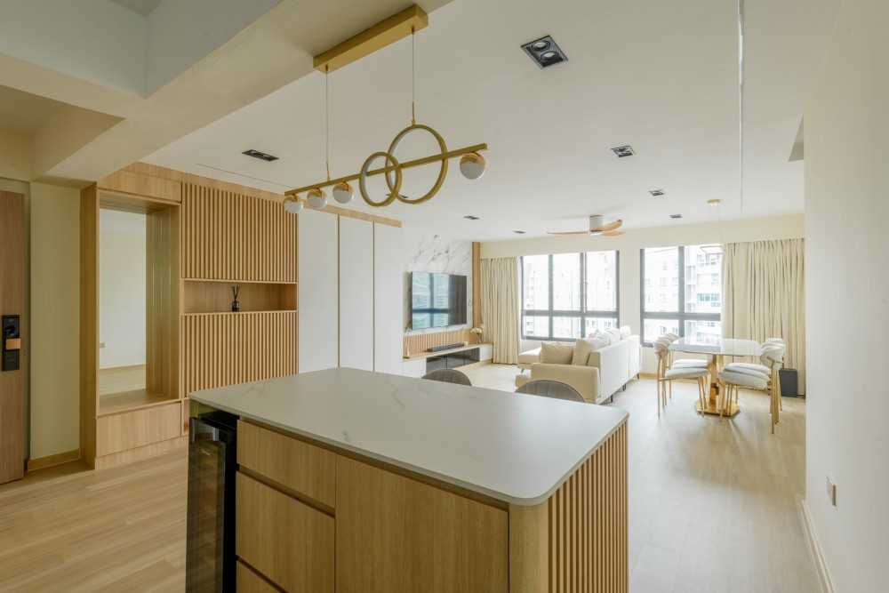
Punggol Way 265C ($65,000) by Mr Designer Studio
This trend is all about sophistication, drawing inspiration from soft, muted colour palettes, earthy tones, and organic forms.
It embraces a holistic approach to design, where every element speaks of tranquility and harmony with nature.
In the sanctuary of Quiet Luxury, simplicity reigns supreme, inviting us to slow down, unwind, and savour the moments of quiet beauty that surround us.
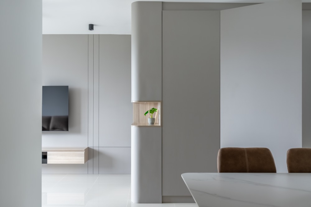
Punggol Drive ($41,000) by U-Home Interior Design Pte Ltd
Quiet Luxury essentials
Soft and muted hues: The latest rendition of muted colours leans towards subtle and calming tones, including gentle grays, muted greens, and soft blues. These colours create a serene atmosphere, promoting relaxation and well-being.
Earthy tones: The incorporation of earthy tones, such as warm terracottas, rich browns, and deep greens, brings a grounding element to the aesthetic. This connection to nature aligns with the broader trend of biophilic design, fostering a sense of tranquility.
Sustainable materials: In the spirit of eco-conscious living, the Quiet Luxury trend emphasizes the use of sustainable materials. From reclaimed wood to recycled fabrics, the focus is on reducing environmental impact while enhancing the overall quality and uniqueness of the space.
Organic forms: Fluid, organic shapes are a key element in Quiet Luxury design. Furniture, decor, and architectural elements embrace curves and natural forms, creating a harmonious and visually pleasing environment.
Using the trend in your home:
Quiet Luxury is particularly well-suited for living rooms and bedrooms, where a soothing ambiance is desired. Consider plush, earth-toned furniture, muted textiles, and organic-shaped decor items.
Where sustainability is concerned, choose sustainable materials for furniture, flooring, and accessories. Bamboo, cork, and recycled metal are excellent options that align with the ethos of Quiet Luxury.
Finally, maximize natural light to enhance the muted colours and earthy tones. Large windows, sheer curtains, and well-placed mirrors can contribute to an airy and light-filled atmosphere.
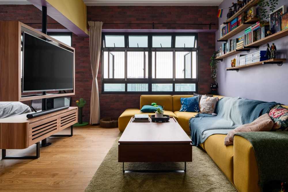
Dopamine Decor
In stark contrast to the serene subtlety of muted colours, the Dopamine Decor trend is all about injecting vibrant energy and joy into living spaces.
131 Kim Tian ($65,000) by MET Interior
This trend recognizes the impact of our surroundings on our mood and aims to create spaces that elicit positive emotions.
Dopamine Decor essentials
Bold and playful colours: Think energetic yellows, vibrant reds, and electric blues. Dopamine Decor embraces colours that evoke happiness and excitement. These hues are strategically incorporated into various elements within a space.
Whimsical patterns: From geometric shapes to playful patterns, Dopamine Decor embraces the whimsical. Wallpaper, textiles, and even furniture with eye-catching designs contribute to the overall dynamic atmosphere.
Mixed materials: Combining different materials adds an eclectic and visually stimulating touch. Mixing metals, glass, and bold textiles creates a sense of variety and personality.
Statement furniture: Dopamine Decor encourages the use of statement furniture pieces. Boldly coloured sofas, unique chairs, and eye-catching tables become the focal points of the room, infusing personality into the space.
Using this trend in your home:
Choose one wall to be a canvas for a burst of vibrant colour or an exciting pattern. This adds a focal point without overwhelming the entire space.
Introduce bold colours through accessories and decor items. Cushions, rugs, and artwork are excellent ways to experiment with the Dopamine Decor trend without a long-term commitment.
Unique and whimsical lighting fixtures contribute to the overall joyful atmosphere. Consider pendant lights with vibrant shades or playful designs.
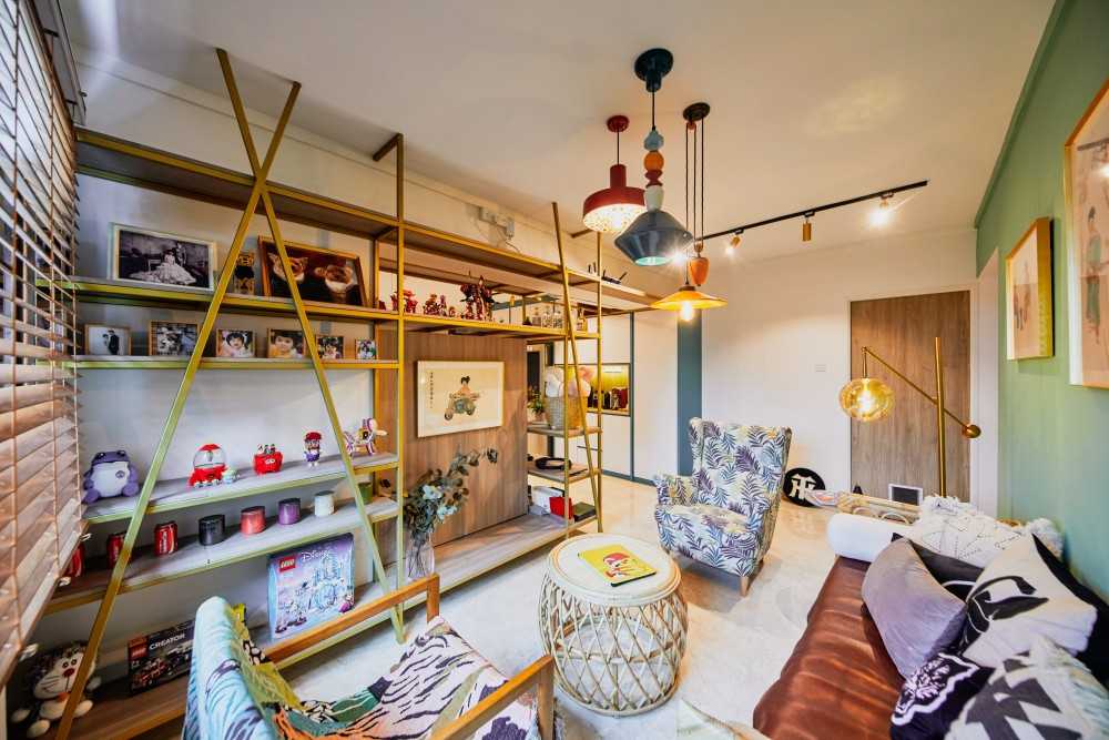
Boon Lay Meadow ($50,000) by Dots ‘N’ Tots Interior Pte Ltd
Assessing Your Space
Considering the unique characteristics of each room is a crucial step in the process of planning and coordinating colours for a home renovation.
Some things you’ll want to take into consideration include:
- Size
- Layout
- Amount of natural light
- Existing furniture and decor
Room size
In smaller rooms, lighter colours tend to create an illusion of space and openness. Whites, pastels, and other light tones can make a room feel larger and more airy. Avoiding dark, saturated colours helps prevent a cramped feeling.
On the flip side, larger rooms offer more flexibility. While lighter colours maintain a sense of openness, darker and richer hues can be used to add warmth and coziness without overwhelming the space. Consider accent walls or strategically placed pops of colour.
Room layout
For areas with an open layout, maintaining a cohesive colour scheme across different zones is essential. Choose colours that complement each other and create a seamless flow. Consistency in colour tones helps unite diverse spaces.
In rooms with distinct functions and separate walls, you have more freedom to experiment with bolder colours. Consider the purpose of each space and choose colours that enhance its function while ensuring an overall harmonious look when transitioning between rooms.
Natural light
Rooms with ample natural light offer more versatility in colour choices. Light and neutral colours can enhance the brightness, creating a fresh and inviting atmosphere. Consider experimenting with both warm and cool tones based on the direction and intensity of the sunlight.
In rooms with limited natural light, it’s advisable to stick to lighter colours to prevent a cave-like feeling. Whites, creams, and light grays can help bounce and reflect light, making the space feel brighter. Consider incorporating mirrors to enhance the perception of light.
Existing furniture and decor
If you have furniture pieces that are visually striking or have bold colours, consider how your chosen colour palette complements or contrasts with them. Harmonizing the colours can create a unified look, while contrasting colours can make the furniture stand out.
What about rooms with neutral or monochromatic furniture? In these spaces, you have more freedom to experiment with a diverse colour palette. Bold wall colours, accent furniture, or vibrant decor items can add personality without clashing with existing pieces.
Furniture aside, consider the patterns and textures present in furniture and decor. Ensure that the chosen colours work harmoniously with these elements. For example, if you have patterned upholstery, choose colours that complement rather than compete with the patterns.
Choosing Your Colour Palette
Establishing a cohesive colour palette for each room involves thoughtful consideration of various factors to ensure harmony and balance throughout your home.
Now that you understand the theory of it all, here’s a practical guide on how to create a cohesive colour palette for each room.
Step 1: Assess your space, taking into consideration all the points we mentioned in the previous section.
Step 2: Choose the base colour for each room.
Choose a dominant colour for each room that sets the tone and serves as the foundation of your palette. This colour will be prominent in the walls, larger furniture pieces, or key architectural elements.
Here, make sure to align the dominant colour with the overall theme or style you want to achieve in each room. For example, soft pastels for a romantic bedroom or earthy tones for a rustic-inspired living room.
Step 3: Add accent colours
Once you’ve chosen the dominant colour, select carefully curated accent colours to complement it. These accents can appear in smaller furniture pieces, textiles, accessories, and decor items.
Aim for a balance of warm and cool tones to create visual interest and depth. Contrast can be achieved by incorporating accent colours that are opposite on the colour wheel or by using shades and tints of the dominant colour.
Step 4: Ensure cohesion between rooms
While each room may have its distinct personality, strive for cohesion by incorporating elements of the same colour palette throughout your home. This could include repeating accent colours or using variations of the dominant colour in adjacent rooms.
Pay attention to how colours flow from one room to another, especially in open-concept spaces. Use transitional elements such as rugs, artwork, or architectural details to create a seamless transition between colour palettes.
Step 5: Test, test and test some more!
Before committing to a colour palette, test paint samples and gather fabric swatches to see how colours look in different lighting conditions and alongside existing furnishings.
Be open to adjusting your colour palette as needed. Sometimes, certain colours may not work as well as anticipated, and it’s okay to make adjustments to achieve the desired result.
A Final Word On Coordinating Colours For Your Home
In conclusion, planning and coordinating colours for a home renovation is a creative yet strategic process.
By understanding colour theory, assessing your space, and carefully implementing your plan, you can transform your home into a personalized, harmonious haven.
Don’t be afraid to experiment with colour and let your unique style shine through in every room. Happy renovating!
Want to check out home renovation projects for more inspiration? Browse home renovation projects on Hometrust, or click the button below to get connected with expert designers!
Renovating soon? Let Hometrust recommend the best interior designers.
If you are reading this, you are probably wondering how you can create your dream home.
Here’s the thing, everyone’s needs and requirements for their home renovation is different. A designer that may work for someone else, may not quite work for you.
At Hometrust, we’re here to help match top rated designers, recommended by past homeowners to you through our data-driven and matching algorithm.
Whether you are looking for partial renovation or a full fledge overhaul, we’ll be able to recommend you top designers to match your renovation requirements and lifestyle.
Recommendations and free and you can simply start by helping us understand your needs below!
Get RecommendationsRenovate safe!
The Hometrust Team